Make your text graphics stand out in Premiere Pro with these 6 six tips.
Cover image via Shutterstock.
Adobe Premiere Pro’s latest update introduced the brand new Essential Graphics panel, an entirely new way to work with graphics. However, while the new layout offers video editors a different way to create and customize graphics, design principles remain the same. Let’s take a quick look at six simple tips to make your text stand out in Adobe Premiere Pro.
1. Blur the Background
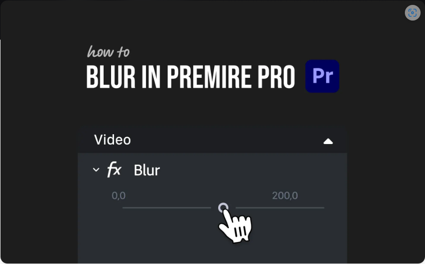
One of the main ways to make graphics stand out in your video is to make adjustments to elements in the background. Apply a slight blur effect to your underlying video layer and instantly draw the viewer’s attention to your overlying text. Think about when you shoot with a shallow depth of field during an interview to blur out the background. This makes your interview subject stand out from the background, drawing the viewer’s eye. To find several different blur effects, open the Effects panel and then search through Video Effects > Blur & Sharpen.

2. Lower the Opacity
Adjusting the Opacity of an underlying video layer is another way to bring attention to your overlying graphics. Simply lowering the opacity of a video or still image will make your text stand out. Lowering the Opacity in conjunction with blurring is a quick and simple way to really make your text pop. Control your opacity in the Effect Controls panel.

3. Add a Stroke
If you’re in a situation wherein you can’t or you don’t want to lower the opacity or add a blur effect to your background, you can add a stroke to your text layer. To show you how a stroke can help make your text more visible, I’ll use an example with simple black-and-white text. If I take white text and place it on a white background you cannot see the text at all. However, if I add a black stroke to my white text, it instantly becomes visible. Even if I change the background to black we still see the white text.

4. Create Motion
Use motion graphics templates to bring some life to your graphics. In Adobe Premiere Pro’s new Essential Graphics panel, you’ll find a handful of presets. I’ll grab one and bring it into my project and modify the text. Then, I’ll add a few additional keyframes to create constant-yet-subtle movement while the text is onscreen. A simple scaling or position animation can bring a graphic to life.

5. Change the Position
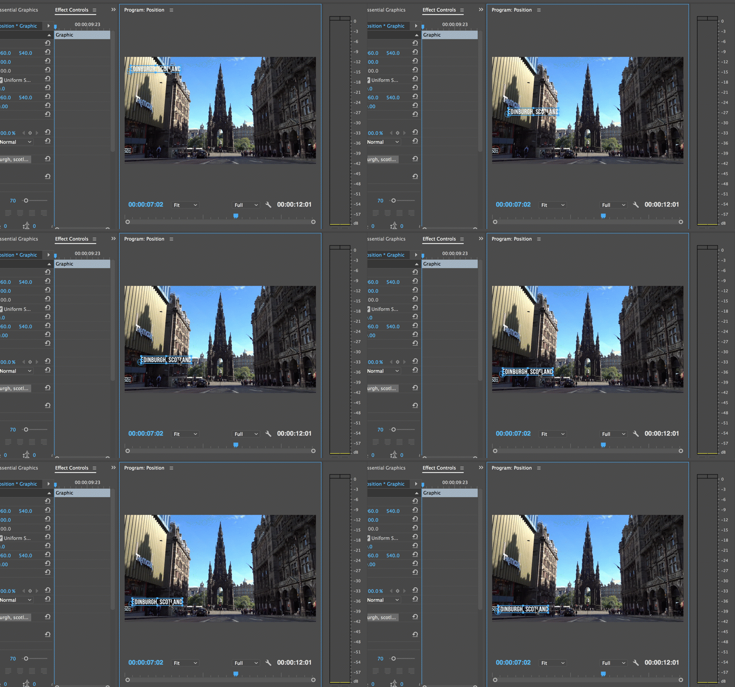
As simple as it sounds, positioning can play a large role in how your text displays on a screen. Depending on what you have onscreen and the color of your text, the position can make your graphic stand out or blend into the background. If I’m using basic white text, for example, I want to find darker parts of the screen so that the contrast will help my text become more visible.

6. Add a Shape Layer
If you’ve ever created captions in Adobe Premiere Pro, you’ll notice that a black background accompanies the white text. This makes the white text visible, no matter what’s in the background. You can manually create this in the essential graphics panel by adding a new rectangle shape layer and then resizing it. After you have your rectangle in position, adjust the opacity for the look you want.


